
5. Formatting: Font
Contents: The importance of using accessible fonts; guidance on implementation.
Why is the font important?
For design reasons, it can often be useful to highlight text using colour, italics, bold or underlining. In such cases, care must be taken to ensure that the text remains legible in alternative output formats. From an accessibility perspective, text in italics or with low contrast can be difficult to read.
How do you ensure your text is accessible?
Special formatting such as bold, italics or underlining should be used sparingly to ensure accessibility.
You can find special formatting options in the text editor, which opens in edit mode on the ILIAS page as soon as you click on a text field.
To do this, first click on "Design page", then click on the plus sign and select "Insert text". In the text editor, you will find various special formatting options under "Character formats" (see Fig. 1).
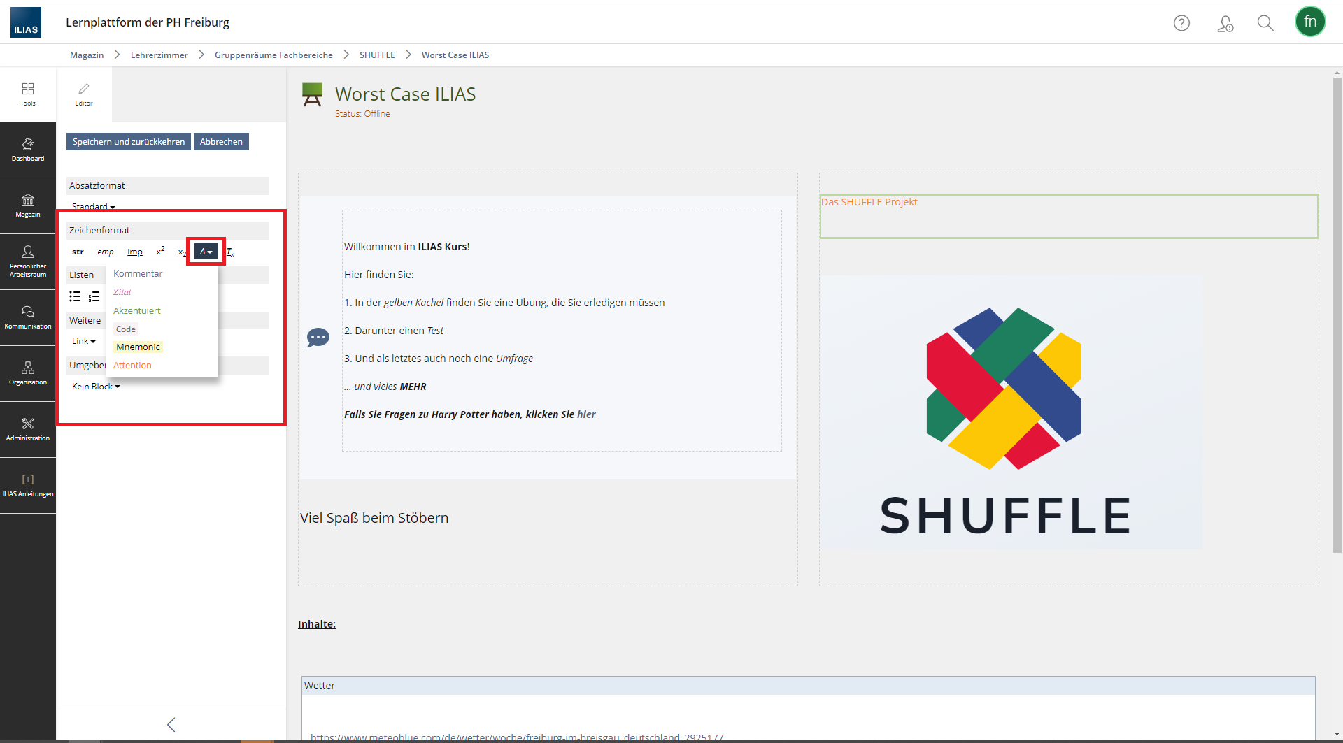
Fig. 1: Special formatting options in the text editor.
Under the "A with an arrowhead" icon, you will find a range of pre-set options for colouring the text.
The WCAG 2.1 Web Content Accessibility Guidelines state that the contrast between the foreground and background colours must be at least 4.5:1.
For this reason, it is recommended that only the following colour formatting be used:
- Comment
- Code
- Mnemonic
The Quote, Emphasis und Attention formatting styles fall below the contrast standard set out in WCAG 2.1. You can determine the contrast ratio, for example, using the open-source tool Colour Contrast Analyser.
No comments to display
No comments to display